

RBT graphing means turning defined behavior data into a visual record that can be entered, updated, checked, and discussed. For exam preparation, the key is not drawing a decorative chart. It is matching the graph to the measurement system, placing data accurately, identifying a pattern such as trend, level, or variability, and communicating what the data show without inventing a cause.
Table of Contents
- RBT graphing: what the graph is for
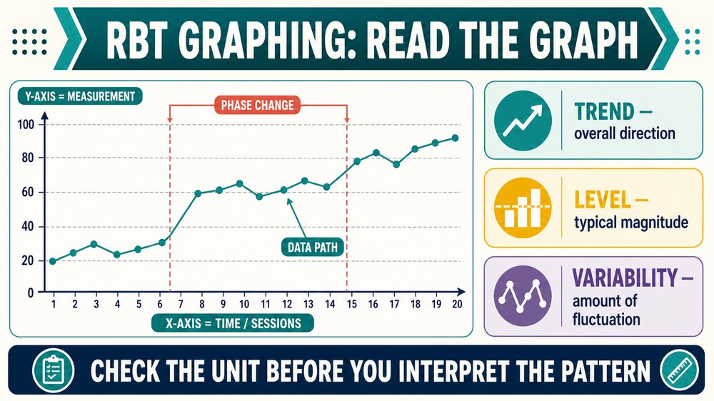
- RBT graphing: parts of a typical line graph
- How RBT graphing shows trend, level, and variability
- Phase changes, data paths, and conditions
- A practical RBT graphing and data-update workflow
- Common RBT graphing mistakes
- What to report after reviewing a graph
- Original RBT graphing scenarios
- Frequently Asked Questions
- References
The current RBT Test Content Outline, 3rd edition, includes A.4, enter data and update graphs, and A.7, identify trends in graphed data. Those tasks sit inside Data Collection and Graphing. The current TCO contains 43 tasks across six domains, and the current exam frame includes 75 scored questions and 10 unscored pilot questions among 85 presented questions. This is independent study content, not an official BACB graph, recalled exam question, leaked item, endorsed answer key, or pass guarantee.
RBT graphing: what the graph is for
A graph displays measurements across time or conditions so the team can see patterns more easily than in a column of numbers. The graph does not create better data; it makes the data’s structure visible. If the measurement definition changes, the graph may look different even when the behavior has not changed.
Graphing supports at least four practical questions: Did the data get entered accurately? Is the response increasing, decreasing, or stable? How much do the points vary? Did the pattern change after a new condition or intervention phase? The RBT can complete the assigned mechanics and identify a visible trend under the current role and supervision structure. A graph alone does not authorize an independent treatment change.
RBT graphing: parts of a typical line graph
| Part | What it usually communicates | Check before interpreting |
|---|---|---|
| Title | What behavior, skill, or measure is displayed. | Does it match the target and measurement system? |
| X-axis | Time, sessions, dates, or another ordered observation sequence. | Are sessions in the correct order? |
| Y-axis | The measurement scale, such as frequency, rate, percentage, or duration. | Are units and intervals labeled correctly? |
| Data point | The value recorded for one session or observation unit. | Does it match the source data? |
| Data path | Lines connecting successive points to show change over time. | Are points connected in order, without invented values? |
| Phase or condition line | A boundary between conditions, such as baseline and intervention. | Does the line correspond to a documented change? |
For example: if an RBT graphs independent requests per session, the x-axis may list session numbers and the y-axis may show the number of independent requests. A point at session 4 is not a percentage unless the y-axis says percentage. Labels are part of the measurement, not an optional design detail.
How RBT graphing shows trend, level, and variability
Trend is the overall direction of data across time: increasing, decreasing, or relatively flat. Trend is not determined by one point. Look at the direction of the series and consider the condition, time span, and amount of scatter.
Level is the typical magnitude of data in a segment or condition. A graph can have a high level with a flat trend, or a low level with an increasing trend. “High” and “low” require context from the scale and target.
Variability is the amount of fluctuation among points. Points close together show lower variability; points that move widely up and down show higher variability. A series can have an overall decreasing trend and still contain substantial variability.
| Pattern | Plain-language description | Careful statement |
|---|---|---|
| Increasing trend | Later values are generally higher. | “The graphed measure shows an upward pattern across these sessions.” |
| Decreasing trend | Later values are generally lower. | “The graphed measure shows a downward pattern after the documented phase change.” |
| Stable level | Values remain relatively similar. | “The points are clustered around a similar range.” |
| High variability | Values change substantially across adjacent observations. | “The series is variable; more review is needed before a conclusion.” |
Phase changes, data paths, and conditions
A vertical phase line often marks a documented change in condition, such as the start of an intervention. It is not itself a data point and does not prove that the intervention caused the next pattern. A graph may also show separate data paths for different targets, settings, or participants. Read the legend and labels before comparing them.
When a new phase begins, ask whether the measurement system, target definition, observer, setting, schedule, or materials also changed. A sudden visual shift can reflect a procedural change, not only a change in behavior. The RBT should report what was observed and what the record says changed; the supervising clinician evaluates the broader clinical meaning.
A practical RBT graphing and data-update workflow
- Verify the source: compare the data sheet, electronic record, and session note.
- Confirm the unit: frequency, rate, duration, latency, percentage, interval score, or another defined measure.
- Enter in order: place each session or observation on the correct x-axis position.
- Check the scale: confirm labels, intervals, decimal places, and any required conversion.
- Update the data path: connect or display points according to the approved graph format.
- Check for errors: look for duplicate entries, missing values, misplaced points, and impossible values.
- Mark conditions: add a phase line or note only when the change is documented.
- Report uncertainty: tell the supervisor when source data are missing, inconsistent, or affected by an interruption.
Do not edit a data point because it looks unusual. An unusual value may be accurate and clinically important. If an entry is genuinely a transcription error, correct it according to the workplace system so the change is traceable.
Common RBT graphing mistakes
| Mistake | Why it matters | Better action |
|---|---|---|
| Using the wrong y-axis unit | It changes the meaning of every point. | Read the measurement definition and label. |
| Plotting sessions out of order | It can create a false trend. | Match the date or session identifier. |
| Connecting missing data as if it existed | It invents a value and hides the gap. | Use the approved missing-data convention. |
| Calling one high point a trend | Trend describes an overall pattern. | Review several points and the condition. |
| Changing data to make a graph smoother | It destroys data integrity. | Preserve the original record and report the issue. |
| Assuming correlation proves cause | A phase change and behavior change can have multiple explanations. | Describe the graph and seek clinical interpretation. |
What to report after reviewing a graph
RBT graphing includes identifying trends, but the safest communication separates what is visible from what is inferred. A useful statement names the measure, time range, direction, variability, and relevant documented condition. It can then ask the supervisor what review is needed.
For example: “Independent requests increased from a low range in sessions 1–4 to a higher range in sessions 5–8 after the documented teaching-phase change. Two points are missing because the session ended early. Please confirm whether the current data are sufficient for the next program step.” This reports a pattern without declaring mastery or changing the plan.
- Report data irregularities and missing observations.
- Report a change in setting, materials, observer, schedule, or client condition when relevant.
- Use objective language such as increased, decreased, stable, variable, or unclear.
- Do not disclose client information outside approved channels.
- Ask for direction before changing a measurement or intervention procedure.
Original RBT graphing scenarios
Scenario 1—axis: a graph shows session number on the horizontal axis and percentage of independent responses on the vertical axis. A point at 80 means 80 percent under that label, not 80 responses.
Scenario 2—phase line: a vertical line separates baseline and intervention. The line marks a condition change; it is not evidence by itself that the intervention caused the next data pattern.
Scenario 3—variability: points rise and fall widely across five sessions, even though the final point is lower. Describe the series as variable and avoid calling it a clear decreasing trend from one point.
Scenario 4—data integrity: an RBT notices that one point was entered under the wrong session date. Correct or flag it according to the system and report the correction; do not redraw the graph silently.
These are newly written independent study examples, not official, recalled, leaked, or BACB-endorsed questions.
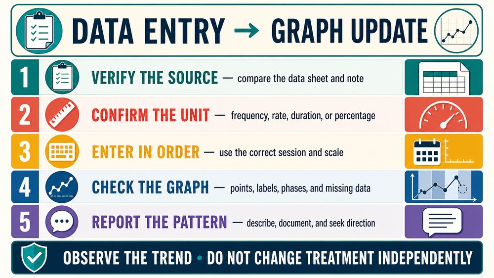
Bottom line: RBT graphing is accurate data entry, graph updating, and identification of visible patterns. Read the axes, units, data path, phase changes, trend, level, and variability. Then communicate what the graph shows and seek supervision before making any clinical change.
Practice graph-reading decisions.
Review original RBT scenarios on axes, data paths, phase changes, trend, level, variability, and data integrity.
Try free RBT practice questions →
Frequently Asked Questions
What does RBT graphing include?
It includes entering data, updating graphs, checking labels and units, and identifying visible patterns such as trend, level, and variability within the assigned role.
What does the x-axis usually show?
It commonly shows time, sessions, dates, or another ordered observation sequence. Always follow the graph label.
What does a phase-change line mean?
It marks a documented change in condition, such as the beginning of an intervention. It is not itself a data point or proof of causation.
Can an RBT change a treatment plan after seeing a graph?
An RBT can report the pattern and seek direction. Independent treatment changes are outside the role boundary unless authorized within the applicable professional structure.
Are these official RBT graph questions?
No. They are newly written independent study examples and are not official, recalled, leaked, or BACB-endorsed questions.
References
- Behavior Analyst Certification Board. RBT Test Content Outline (3rd ed.).
- RBT Data Collection and Graphing study guide. Reviewed for competitor research; not an endorsement.
- RBT data and graphs practice questions. Reviewed for competitor research; not an endorsement.
- Graphing for RBTs training video. Reviewed for competitor research; not an endorsement.
- How to enter data and update graphs. Reviewed for competitor research; not an endorsement.